I LIKE THIS! Simple Bank
Recently I switched bank accounts and subsequently all expense funding. With no formal income and all of my money now dedicated to paying absolute necessities (housing, utilities, food, etc.), I chose to move my money from an institution who also managed one of my credit card accounts, to a bank with no ties to any of my debts. It occurred to me shortly after leaving my job that my old bank might be able to acquire rights to the money in my checking account which I had been transferring in from a different bank. I couldn't afford to let that happen and risk losing my home. Also, I discovered that my old bank was charging me a $12 fee for not having direct deposit anymore! Anyway! This is how I came to discover Simple.
First I searched online for a checking account with zero fees given my absolute fury about being charged money for not having money deposited in a specific way. Then I searched for banks who offered no-fee accounts that also earned interest — why not right? I came upon NBKC and Simple, neither of which operate physical branches or have ties to any of my debts. I downloaded their apps, made my initial deposits and waited for the debit cards to arrive and the accounts to formalize.
Right from the start, NBKC was more cumbersome to navigate and manage so I decided I would use that account for savings, since it earned the most interest and I would interact with it less if I wasn't using it to pay my bills. Simple was definitely the more modern of the two and most likely entirely created to satisfy the millennial generation, which is to say it was beautifully designed and the set up was easy and intuitive; the deposits show up in green, the debits in red, everything is clean and easy to understand. Not only that, when I'm logged into my account, there are sidebars and quick links to set up savings goals and budgets and ways to organize my charges in any way I see fit.
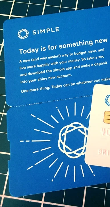
Then the debit cards arrived, an event typically involving an unmarked white envelope with a plastic card stuck to a generic form letter. NBKC lived up to expectations, Simple exceeded them. In fact, the packaging with Simple was so significantly different and thoughtful, I kept part of it! It arrived inside a custom greeting card and attached to a smaller, die-cut card decorated with some illustrations and motivational words. The back of the Simple card is the exact blue of the packaging and felt and looked to be of a much higher quality than the one from NBKC. It has a matte finish with a pleasing weight; it's a small feature but the thickness and the softspun finish are tactile perks every time I pull out the card.
First impressions aside, I went ahead with switching all of my auto-pays and updating PayPal and Venmo, linking accounts as necessary, blah blah blah. You know what happens when you do these things? You need to access your account numbers, routing and bank — guess who made this easier? With Simple, whether accessing my account via a desktop browser or the mobile app, there is a quick link to 'see account numbers' and once there, the system is automatically set up to copy the number to my clipboard once I click on it. This is thoughtful design — being aware that if you're looking for your account numbers, it's most likely because you need to input it somewhere else! With NBKC, the full numbers are not available on the site, on the app or the statements; I had to actually go through the trouble of contacting them via phone, chat or email just to gain access to my own information. Realizing this led me to immediately decide to close my NBKC account, it was absolutely the last straw given the clunky interface and generally unpleasant experience of using their service.
You may think my appreciation for Simple stops there but you'd be so wrong! In addition to the motivating message on their packaging, they send emails with the same vibe — encouraging savings and ways to organize your account to create and achieve financial goals. AND! They send you an immediate alert every time a charge hits your account or card. This especially handy when dining out; not only does the card swipe prompt an immediate alert, it also recognizes that the charge has originated from a restaurant and so the alert also tells you how much a 20% tip would be so that by the time a server arrives with the bill to sign, you don't have to waste a second fumbling to calculate what to leave for gratuity. These are the kind of details that make banking a surprisingly pleasant experience, which is not at all something I ever expected.
I've had bank accounts with a variety of big institutions over the years and while some have been better than others, I have never been compelled to write a testimonial on the bank's behalf. I've been enjoying my new account so much that I kick myself a little thinking about all the years I wasted with corporate giants. Simple has created a brand and a boutique style of service that goes far beyond just a good app or web layout. As a customer, I feel taken care of in a very complete manner and it is obvious that every single step of the banking experience has been thoughtfully considered and beautifully addressed with functional design. Well done!
***
Disclaimer: Simple Bank is operated as a subsidiary of BBVA Compass who is listed on the list of Dakota Access pipeline funders. I absolutely do not agree with the funding or operation of a pipeline but this post is not about that. This recommendation is about an interface and a full customer experience and not meant to be political nor is it a demonstration of support for the pipeline.


